

Your Website Is Having Conversations You’re Not In.
Your website is talking, is it saying what you want it to?
Most business owners think of their website as a marketing tool. They view it as a digital brochure, a place where potential customers can learn about the company, find a phone number, or submit a contact form. While all those things are true, they only tell part of the story.
Every day, people visit your website and make decisions about your business long before they ever speak with you. They decide whether you seem trustworthy, whether you understand their problem, whether you appear professional, and whether contacting you feels worth the effort. In many cases, those decisions are made within minutes.
The reality is that your website is having conversations with potential customers all day long. The challenge is that you are rarely there to hear them.
The Real Job of a Website
Most visitors arrive with a similar set of questions. Can this company help me? Do they understand what I need? Are they credible? Will they be responsive? What happens if I reach out? How much are their services/products? Your website answers every one of those questions, whether you intended it to or not.
A confusing navigation menu says something. Outdated information says something. Generic content says something. Broken links, missing details, and unclear service descriptions all communicate messages to potential customers. Visitors are constantly collecting clues and forming opinions about your business both consciously and subconsciously.
This is where many business owners run into trouble. They spend a great deal of time thinking about what they want their website to say. Customers spend their time trying to determine whether the website is answering the questions they care about. Those are not always the same thing.
A company may proudly state that it delivers excellent customer service. However, if visitors struggle to figure out what the company actually does, the experience creates doubt rather than confidence. Another business may describe itself as organized and professional, yet an outdated website can quietly communicate the opposite.
The strongest websites are not necessarily the most creative or the most expensive. They are the websites that remove uncertainty. They make it easy for visitors to understand who the business helps, what problems it solves, and what to do next.
Every potential customer is trying to answer a series of questions before deciding whether to move forward. The faster those questions are answered, the easier it becomes for people to trust the business and take action. The longer they remain unanswered, the more likely visitors are to leave and continue searching elsewhere.
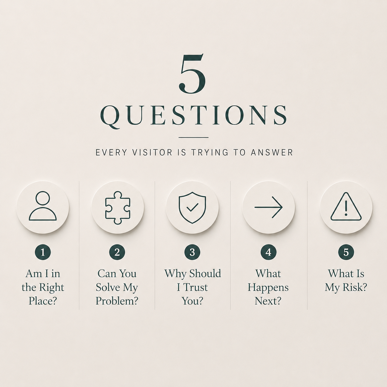
Here are five questions almost every visitor is trying to answer.
Am I in the right place?
This is the first hurdle every website must clear.
Before visitors care about your history, your process, or your credentials, they want to know whether you can help them. They are trying to determine whether you solve the type of problem they have and whether you work with people like them.
Many websites accidentally bury these answers beneath clever taglines, industry jargon, or lengthy company introductions. Visitors should not have to investigate what a business does. They should be able to understand it quickly.
One of the easiest ways to improve a website is to make it immediately clear who you help and what you help them accomplish.Can you solve my problem?
Customers rarely shop for services. They shop for outcomes.
Nobody wakes up wanting a new website. They want more credibility, more leads, or a stronger first impression. Nobody wants project management software. They want less confusion, better communication, and fewer things falling through the cracks.
The distinction matters.
Many businesses spend too much time describing their services and not enough time explaining the results those services create. Potential customers are far more interested in how their situation improves than in the technical details of how the work gets done.
A strong website connects services to outcomes. It helps visitors understand what changes after they decide to work with you.
Why should I trust you?
Trust is one of the most important factors in any buying decision.
Customers are evaluating more than your services. They are evaluating your credibility. They want reassurance that you understand their challenges and that you have successfully helped others in similar situations.
This is why testimonials, examples, case studies, and relevant experience matter. They provide evidence. Evidence is far more persuasive than claims.
Most businesses have more credibility than they realize. The problem is that they often fail to communicate it effectively. A visitor cannot appreciate experience they cannot see.
What happens next?
One of the most common sources of friction on a website is uncertainty about the next step.
Imagine a visitor who is interested in your services and believes you can help. If they're unsure how much you charge, they may hesitate to reach out. If they're worried they'll end up on a never-ending list of sales calls and marketing emails, they may decide it's not worth the risk. If they aren't sure whether they should call, schedule a consultation, request a quote, or send an email, they may postpone the decision altogether and continue searching for alternatives.
People are more comfortable taking action when they understand what to expect. Clear calls to action, service and pricing transparency, straightforward explanations, and simple processes help reduce hesitation.
The goal is not to pressure visitors. The goal is to make the next step feel obvious and comfortable.
What is my risk?
This is the question that rarely appears on a website, yet almost every visitor is asking it.
What happens if this doesn't work?
Will this waste my time and/or money?
Will I regret making this decision?
Strong websites reduce perceived risk by providing clarity. They answer common questions, establish expectations, demonstrate expertise, and show evidence of successful outcomes. Every unanswered question creates uncertainty. Every uncertainty creates hesitation.
The businesses that earn trust most effectively are often the businesses that address concerns before customers have to ask.
How to Evaluate Your Website More Objectively
One of the simplest ways to improve your website is to stop reviewing it as the owner and start reviewing it as an investigator.
Ask someone unfamiliar with your business to spend one minute on your website. Then ask them what the company does, who it helps, what problem it solves, and what questions they still have. Resist the urge to explain or clarify. The gap between what you intended to communicate and what they actually understood is often where the most valuable improvements can be found.
Another useful exercise is the ten-second test. Open your homepage and imagine you found it through a Google search. Within ten seconds, can you clearly answer what the business does, who it serves, and why someone should trust it? If those answers are difficult to find, visitors may be experiencing the same confusion.
Pay attention to moments when you catch yourself thinking, "What I really mean here is..." Those moments are important. Visitors do not have access to the explanation in your head. They only have access to what appears on the screen. Every time you feel the need to mentally clarify something, you may have discovered an opportunity to improve the website's communication.
Why Business Owners Struggle to See It
At this point, you may be wondering why these issues are often difficult to spot.
The answer is simple.
You already know too much.
You know what your company does. You know your services, your pricing, your process, and your terminology. You know what you mean when you use certain phrases because you live inside the business every day.
Your customers do not.
Psychologists refer to this as the "Curse of Knowledge." The University of Arizona has a great article about it if you’d like to learn more, but basically, it means that once we understand something, it becomes surprisingly difficult to imagine what it feels like not to know it. Business owners often assume information is obvious because it is obvious to them.
This is why evaluating your own website can be so challenging. You already have all the answers. Your visitors are still looking for them.
The Bottom Line
When business owners tell me they need a new website, I often discover that the website itself is not the primary issue.
The real problem is that the business has evolved while the website has remained largely unchanged. Services have expanded, processes have improved, and customer expectations have shifted. The business has moved forward, but the website is still telling an older version of the story.
That disconnect creates missed opportunities. Potential customers may never see the business as it exists today because they are evaluating it through information that no longer reflects reality.
Your website introduces your business to people you’ve never met. It’s answering questions, creating impressions, building trust, and influencing decisions before you ever have the opportunity to speak with someone directly.
Your website is talking… Make sure it’s saying what you intend it to.
